What it is for
Three jobs, mostly:
- Matching a UI to a hero image or a product photograph.
- Pulling a brand palette out of a logo when nobody can find the brand guide.
- Getting a background colour that sits under an image without a visible seam.
Median cut, briefly
Averaging every pixel of an image gives you the average colour, which for anything with more than one hue is a muddy brown. Median cut avoids this by splitting the colour space instead of the pixels: all pixels start in one box, the box with the widest spread is cut in half along its widest axis, and this repeats until there are enough boxes. The result is a palette that keeps distinct hues distinct.
Extracted palettes are not accessible palettes
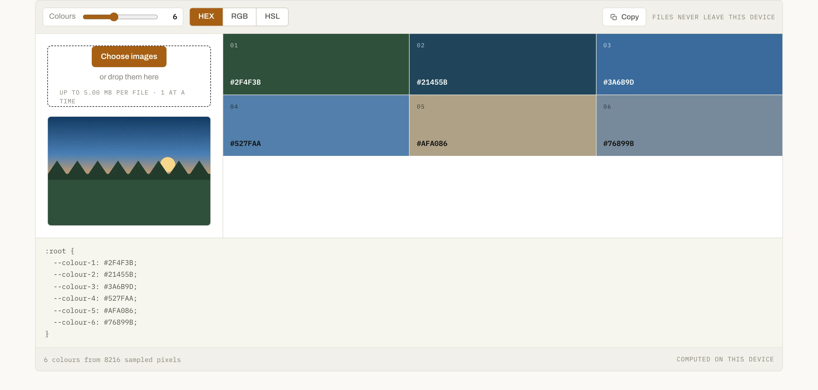
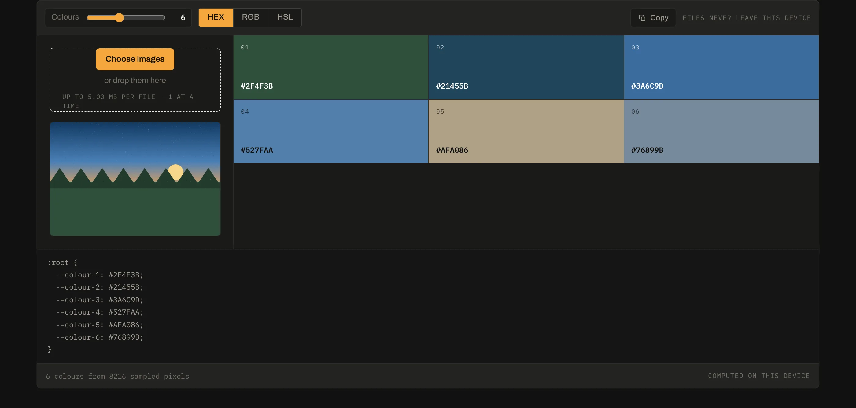
Colours taken from a photograph tend to sit close together in lightness, because a well-exposed photograph does. Two of them side by side will often fail contrast requirements for text. Use the extracted hues as a starting point and set your own lightness values — the palette tells you what the image is made of, not what your interface should be.
Copying out
The panel below the swatches emits the palette as CSS custom properties, which is the form most projects want. Switch the notation to HSL first if you intend to derive lighter and darker steps: adjusting the L channel of an HSL value is far easier to reason about than nudging three hex components.
Questions
How are the colours chosen?+
Median-cut quantisation. The pixels are put in one bucket, and the bucket with the widest colour range is repeatedly split along that range until there are as many buckets as colours you asked for. Each bucket's average becomes a swatch. Simply averaging the whole image instead returns mud for anything with more than one hue, which is why naive dominant-colour tools so often return grey.
Why are the colours ordered the way they are?+
By how much of the image each one covers, most first. So the top swatch is the colour a viewer perceives as dominant, not simply the most saturated one.
Does it read every pixel?+
No, and it does not need to. The image is scaled to fit a 400-pixel box and sampled from there — a few thousand evenly spaced pixels give the same palette as twenty-four million and return instantly. Pixels that are mostly transparent are skipped, since they are not part of what anyone sees.
Can I use these colours directly in a design?+
As a starting point. Colours pulled from a photograph are rarely accessible against each other — they cluster in lightness because photographs do. Take the hues, then set your own lightness and contrast rather than pasting the palette in unchanged.